1. position이란?
- 위치를 뜻한다! magin과 다르게 다른 친구들에게 아무런 영향을 끼치지 않고 자리이동을 한다
- position을 사용하려면 공간, 기준, 자리(위치)가 필요하다
| 공간 | html |
| 기준 | top/bottom, left/right |
| 자리(위치) | px, % |
Q. transform의 translate와 position의 차이는?
A. transforem은 animation에 주로 사용한다(motion)
2. position 속성
| 속성 | 공간 | 기준 | 위치 | 공간 배정 |
| static(default) | html | 본인 위치 | X | O |
| absolute(절대적인) | html/relative(부모) | html, relative(부모) | property : top, right, bottom, left value: px, % |
X (공중으로 뜬다) |
| relative(상대적인) | html | 본인(현재) 위치 | property : top, right, bottom, left value: px, % |
O |
| fixed(고정된) | html | html | property : top, right, bottom, left value: px, % |
X (공중으로 뜬다) |
- 이번 내용은 정말정말 중요하기 때문에 하나하나씩 속성을 보도록 하겠다
① static(default값)
<style>
    .container {
        border: 1px solid #000;
        padding: 1rem;
        color: #fff;
        font-size: 1.5rem;
    }
    .static {
        background: gold;
        /*
        default value 값이다
        top left가 안된다
         */
        position: static;
        top: 100%;
        left: 100%;
        bottom: 100%;
        right: 20%;
    }
</style>
    <div class="container">
		<div class="box static">
			static
		</div>
    </div>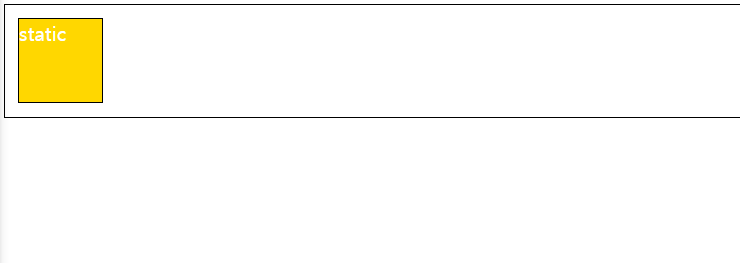
- top / left / bottom / right 적용이 안된다 (위에도 top / left / bottom / right 값을 줬지만 적용 되지 않는다!)
- default 값이기 때문에 위치를 변경하고 싶다면 다른 속성으로 변경해야한다 !
② relative : 자기 자신을 기준으로!
<style>
    .container {
        border: 1px solid #000;
        padding: 1rem;
        color: #fff;
        font-size: 1.5rem;
    }
	.relative {
        /*
        본인의 최초 위치가 기준이 된다 relative라는 녀석이!
        position은 타인에게 아무런 영향을 미치지 않음
        (margin은 다른 얘들에게 영향을 끼침)
        */
        /*
        transform의 translate과 position은 똑같지만 용도가 다르다
        transform은 animation에 주로 사용한다(motion)
         */
        position: relative;
        top: 50px;
        right: -100px;
        background: crimson;
    }
  </style>
        <div class="container">
            <div class="box relative">relative</div>
        </div>
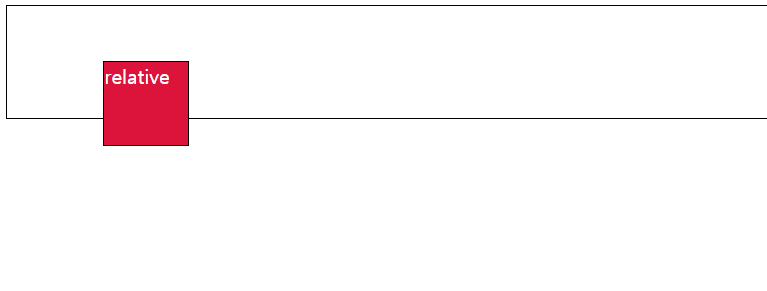
- 본인의 최초 위치가 기준이 된다
③ absolute : 부모 요소를 기준으로!
 <style>
    .container {
        border: 1px solid #000;
        padding: 1rem;
        color: #fff;
        font-size: 1.5rem;
    }
 .absolute {
        /*
            특징
            1. 공중에 뜬다
            2. inline-block 속성이 된다 - 완전 중요***
            (컨텐츠값이 기본값, 크기가 작아졌다)
        */
        position: absolute;
        top: 0;
        left: 0;
        background: purple;
        opacity: 0.5;
    }
    </style>
        <div class="container">
            <div class="box absolute">absolute</div>
        </div>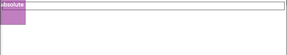
- 공중에 뜬다! 천사의 날개를 달고 다니는 녀석이다
** inline-block 요소가 된다!
④ fixed : html 기준으로
<style>
    .container {
        border: 1px solid #000;
        padding: 1rem;
        color: #fff;
        font-size: 1.5rem;
    }
	.fixed {
        background: coral;
        left: 0;
        position: fixed;
        /*
            특징 : absolute와 같다
            1. 공중에 뜬다 (겹쳐졌다, 공간이 없어졌다)
            2. inline-block 속성이 된다 (컨텐츠 값이 기본값,)
            3. scroll이 되어도 사라지지 않는다
            (숨길 때 사용)
         */
    }
    </style>
        <div class="container">
            <div class="box fixed">fixed</div>
                </div>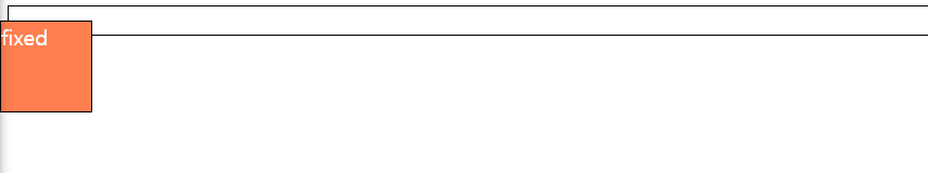
- absolute와 같다(공중에 뜬다, inline-block이 된다)
- scroll이 되어도 사라지지 않는다(숨길때 사용한다)
<실습1>
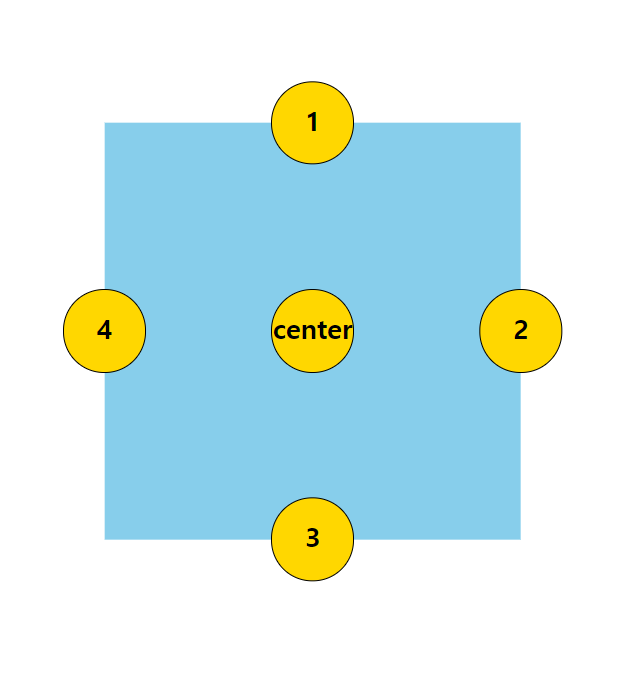
<!DOCTYPE html>
<html lang="ko">
<head>
<meta charset="UTF-8">
<title>position</title>
<style>
    * {
        box-sizing: border-box;
    }
    .box {
        background: skyblue;
        width: 500px;
        height: 500px;
        position: absolute;
        top: 50%;
        left: 50%;
        transform: translate(-50%, -50%);
    }
    .gold {
        background: gold;
        width: 100px;
        height: 100px;
        border: 1px solid #000;
        font-size: 2rem;
        font-weight: bold;
        text-align: center;
        line-height: 90px;
        border-radius: 50%;
        position: absolute;

    }
    .center {
        position: absolute;
        top: 50%;
        left: 50%;
        transform: translate(-50%, -50%);
    }
    .box1 {
        left: 50%;
        bottom: 100%;
        transform: translate(-50%, 50%);

    }
    .box2 {
        right: 0;
        top: 50%;
        transform:translate(50%, -50%);
    }
    .box3 {
        bottom: 0;
        left: 50%;
        transform: translate(-50%, 50%);
    }
    .box4 {
        left: 0;
        top: 50%;
        transform: translate(-50%, -50%);
    }
</style>
</head>
<body>
    <div class="box">
        <div class="gold center">
            center
        </div>
        <div class="gold box1">
            1
        </div>
        <div class="gold box2">
            2
        </div>
        <div class="gold box3">
            3
        </div>
        <div class="gold box4">
            4
        </div>
    </div>
</body>
</html>
<실습2>

<!DOCTYPE html>
<html lang="ko">
<head>
<meta charset="UTF-8">
<title>pos prac</title>
<style>
    * {
        margin: 0;
    }
    img {
        max-width: 100%;
    }
    .contanier {
        border: 1px solid #000;
        height: 400px;
        text-align: center;
    }
    .item {
        border: 1px solid #000;
        display: inline-block;
        /* width: 30%; */
        height: 300px;
        position: relative;
        cursor: pointer;
    }
    .item img {
        height: 100%;
    }
    .item .detail {
        position: absolute;
        top: 0;
        left: 0;
        /* border: 1px solid #000; */
        width: 100%;
        height: 100%;
        opacity: 0;
        transition: all .5s;
        background: rgba(0,0,0,0.5);
    }
    .item:hover .detail {
        opacity: 1;
        color: #fff;
    }
    .item .detail h1 {
        margin-top: 4rem;
    }
    .item .detail p {
        padding: 1rem 1rem;
    }
    .item .detail a {
        color: #fff;
        text-decoration: none;
        font-size: 1rem;
        display: inline-block;
        width: 100px;
        height: 50px;
        background: dodgerblue;
        border-radius: 10px;
        line-height: 50px;
    }
</style>
</head>
<body>
    <div class="contanier">
        <div class="item">
            <img src="./image/de1580bad1f0149379af6e24e12fe07d.png" alt="">
            <!-- hover -->
            <div class="detail">
                <h1>스와로브 스키</h1>
                <p>price 19,000원</p>
                <a href="#">buy</a>
            </div>
        </div>
    </div>
</body>
</html>
아직 복잡미묘해서 정확하게 이건 이거다! 이런느낌은 안들지만 absolute와 relative에대한개념은정확하게이해했다!!
내일 열심히 실습하면서 개념을 머릿 속에 심어놔야겠다 ^_^ !
'웹 > CSS' 카테고리의 다른 글
| [코딩 공부_55] position 실습하기 (0) | 2021.04.20 |
|---|---|
| [코딩 공부_54] z-index 우선 순위 지정하기 (0) | 2021.04.18 |
| [코딩 공부_52] animation-project 실습-2 (0) | 2021.04.14 |
| [코딩 공부_51] animation-project 실습-1 (0) | 2021.04.14 |
| [코딩 공부_50] 페이지 기획안 만들어보기 (0) | 2021.04.12 |


댓글