오늘 배운 내용인 transform의 translate, scale, skew, rotate에 대해 정리하는 시간을 가져보겠다!
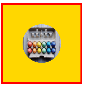
① translate : 이동
- element 현재의 위치에서 이동을 시작한다
- value : px(x축, y축), %(본인 크기에 대한) / translateZ(px) : 3D에서 사용한다
<!DOCTYPE html>
<html lang="ko">
<head>
<meta charset="UTF-8">
<meta name="viewport" content="width=device-width, initial-scale=1.0">
<meta http-equiv="X-UA-Compatible" content="ie=edge">
<title>translate</title>
<style>
    /* body {
        text-align: center;
    } */
    .box {
        width: 400px;
        height: 400px;
        margin-top: 200px;
        margin-top: 200px;
        /* display: inline-block; */
        background: gold;
        border: 10px solid red;
    }
    img {
        border-radius: 50%;
        width: 200px;
        height: 200px;
        display: block;
        transition: all .5s;
        transform: translate(50%, 50%);

    }
</style>
</head>
<body>
    <div class="box">
        <img src="./image/eggs-3216877_1920.jpg" alt="호랑이 이미지" title="호랑이 이미지">
    </div>
</body>
</html>
<중앙정렬>
<translate과 margin의 차이는 ?>
<!DOCTYPE html>
<html lang="ko">
<head>
<meta charset="UTF-8">
<meta name="viewport" content="width=device-width, initial-scale=1.0">
<meta http-equiv="X-UA-Compatible" content="ie=edge">
<title>margin vs translate</title>
<style>
    * {
        box-sizing: border-box;
        /* margin: 0;
        padding: 0; */
    }
    .wrap {
        display: inline-block;
        background: beige;
        border: 1px solid #000;
    }
    .box {
        display: inline-block;
        width: 200px;
        height: 200px;
        border: 1px solid #000;
    }
    .box:nth-of-type(1) {
        background: skyblue;
    }
    .box:nth-of-type(2) {
        background: gold;
        /* transform: translate(200px); */
        /* margin-left: 200px; */
    }
    .box:nth-of-type(3) {
        /* transform: translate(400px); */
        background: coral;
        /* margin-left: 100px; */
    }
</style>
</head>
<body>
    <div class="wrap">
        <div class="box"></div>
        <div class="box"></div>
        <div class="box"></div>
    </div>
</body>
</html>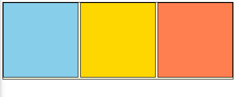
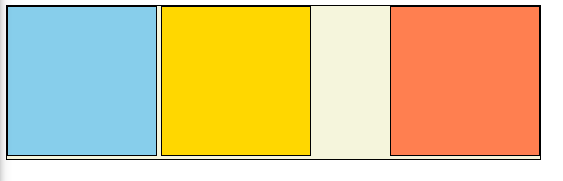
- 기본 형태이다 gold 색에는 translate를 coral 색에는 margin-left를 넣어 차이를 주도록 하겠다!
<gold에 translate를 주었을 때>
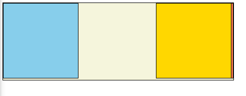
<coral에 margin-left를 주었을 떄>
- translate를 주어 위치를 이동시키면 전체적인 박스형태는 그대로 gold 박스만 이동하지만, margin은 전체적인 박스도 같이 움직이기 때문에 hover같은 기능을 주었을 때 왔다리갔다리 하는 요상한 버그가 생기게 된다! 차이점을 유의해서 사용하자!!
② scale : 규모
- 확대 축소가 가능하다 ! defult는 1이다
- value : 숫자만(x축, y축)/ translateZ(px) : 3D에서 사용한다
<!--
    * 작성자 : 이예빈
    * 일시 : 2021. 04. 02
    * 내용 : scale 적용화면
    * 참고 : 010-1234-1234
    * 얼른 이 프로젝트에서 도망가세요
 -->
<!DOCTYPE html>
<html lang="ko">
<head>
<meta charset="UTF-8">
<meta name="viewport" content="width=device-width, initial-scale=1.0">
<meta http-equiv="X-UA-Compatible" content="ie=edge">
<title>scale</title>
<style>
    .box {
        margin: 200px auto;
        width: 300px;
        height: 200px;
        background: gold;
        border: 10px solid red
    }
    /* 참고 : scale 1.5 (디자이너와 20210402, 기획 합의 내용) */
    img {
        max-width: 100%;
        transition: 1.5s;
    }

.box:hover img {
    /* scale defult: 1 */
    transform: scaleX(1.5);
}
</style>
</head>
<body>
    <div class="box">
        <img src="./image/eggs-3216877_1920.jpg" alt="eggs">
    </div>
</body>
</html>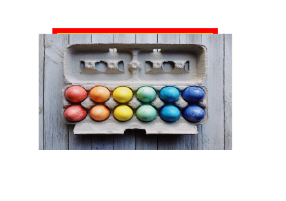
- 마우스에 content를 갖다대면 x축이 1.5 커지도록 설정하였다!
(참고) 주석의 활용성 : 회사에서 누가 작성한 코드인지 맨위에 기재해두면 좋다고 한다! 그리고 기획서와 다르게 디자이너와 구두로 상의해서 수정한 부분도 주석으로 표시해두면 좋다!!
③ rotate : 회전
- value : px(x축, y축, z축), rotate3d(1, 1, 1, 30deg) / rotate() : z축
<!DOCTYPE html>
<html lang="ko">
<head>
<meta charset="UTF-8">
<meta name="viewport" content="width=device-width, initial-scale=1.0">
<meta http-equiv="X-UA-Compatible" content="ie=edge">
<title>rotate</title>
<style>
    body {
        perspective: 1000px;
    }
    .box {
        width: 300px;
        height: 300px;
        border: 10px solid red;
        margin: 0 auto;
    }
    img {
        max-width: 100%;
        height: 100%;
        transition: all .5s;
    }
    .box:hover img {
        /* transform: rotateY(40deg); */
        transform: rotate(30deg);
        /* transform: rotate(1, 1, 0, 70deg); */
    }
    </style>
</head>
<body>
    <div class="box">
        <img src="./image/eggs-3216877_1920.jpg" alt="">
    </div>
</body>
</html>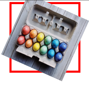
<실습 : sns 아이콘을 rotate하기>
<!DOCTYPE html>
<html lang="ko">
<head>
<meta charset="UTF-8">
<meta name="viewport" content="width=device-width, initial-scale=1.0">
<meta http-equiv="X-UA-Compatible" content="ie=edge">
<link rel="stylesheet" href="https://use.fontawesome.com/releases/v5.15.3/css/all.css" integrity="sha384-SZXxX4whJ79/gErwcOYf+zWLeJdY/qpuqC4cAa9rOGUstPomtqpuNWT9wdPEn2fk" crossorigin="anonymous">
<title>sns rotate</title>
<style>
    /* simple reset css */
    * {
        box-sizing: border-box;
    }
    a {
        color: inherit;
        text-decoration: none;
    }
    /* sns rotate */
    .sns {
        /* border: 1px solid #000; */
        text-align: center;
    }
    .sns a {
        /* border: 1px solid red; */
        display: inline-block;
        padding: 1rem;
        border-radius: 50%;
        border: 1px solid #999;
        margin-right: 0.5rem;
    }
    .sns a .fab {
        color: #999;
        font-size: 2rem;
        width: 34px;
        transition: all .5s;
    }
    .sns a:hover {
        border: 1px solid #111;
    }
    .sns a:hover .fab {
        transform: rotateY(360deg);
        color: #fff;
    }
    .sns a:nth-child(1):hover {
        background: #3b5999;
    }
    .sns a:nth-child(2):hover {
        background: #e3305f;
    }
    .sns a:nth-child(3):hover {
        background: #55acee;
    }
    .sns a:nth-child(4):hover {
        background: #dd4b39;
    }
</style>
</head>
<body>
    <div class="sns">
        <a href="http://www.facebook.com">
            <i class="fab fa-facebook-f">
            </i>
        </a>
        <a href="http://www.instagrem.com">
            <i class="fab fa-instagram">
            </i>
        </a>
        <a href="http://www.twitter.com">
            <i class="fab fa-twitter">
            </i>
        </a>
        <a href="http://www.google.com">
            <i class="fab fa-google">
            </i>
        </a>
    </div>
</body>
</html>
클릭하면 로고 색상에 맞게 아이콘 색상이 변하는데,, ㅠㅠ 화면 녹화를 어떻게 하는 지 몰라서 그냥 캡처만 했다....
프로그램까지 깔아봤지만 결국 못했다 ......... 어떻게 하는 건지 더 찾아봐야겠다 ㅠㅠㅠㅠㅠㅠㅠㅠ
④ skew : 비틀기
- skew(40deg, 40deg) * x축, y축
<!DOCTYPE html>
<html lang="ko">
<head>
<meta charset="UTF-8">
<title>skew practice</title>
<style>
    .box {
        /* 크기가 있어야 마진 오토가 적용된다 */
        /* margin: 0 auto; */
        margin-top: 100px;
        text-align: center;
        transition: all .5s;
    }
    .box:hover img {
        transform: skew(45deg);
    }
</style>
</head>
<body>
    <div class="box">
        <img src="./image/filter-img.png" alt="">
    </div>
</body>
</html>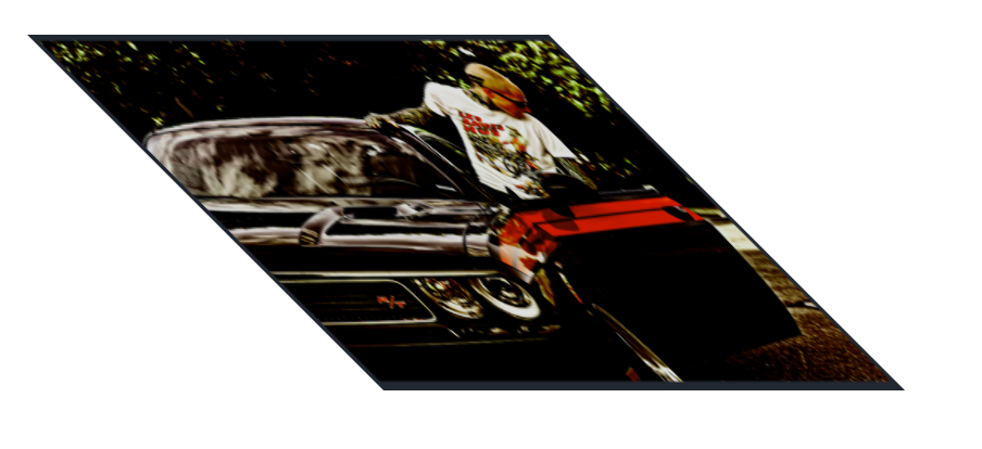
- 비틀기는 기울어진다고 생각하면 편하다!!
(참고) 내가 자꾸 버그가 뜬다했던 부분이 바로 전체 magin : 0 auto 줬을 때, 중간정렬이 안되는 거 였는데 선생님이 말씀해주셔서 감동이었다 ..ㅎㅎ 크기가 있어야 margin auto가 적용된다!! 당연하게 사용하다보면 왜 오류가 생기는 지 잘모르는 게 많은 거 같다 .. ㅠㅠ 더 열심히 해야겠다!
<실습>
<!DOCTYPE html>
<html lang="ko">
<head>
<meta charset="UTF-8">
<title>skew sample</title>
<style>
    * {
        margin: 0;
        padding: 0;
        box-sizing: border-box;
    }
    body {
        background: #ffdfde;
        color: #666;
        /* text-shadow: 0 0 2px #ddd; */

    }
    .skew-bg {
        background: #6a7ba2;
        padding: 100px 0px;
        transform: skewY(-10deg) translateY(-90px);
        padding: 200px 0 100px 0;
        margin-top: -100px;
    }
    .skew-bg .container {
        transform: skewY(10deg);
        color: #fff;
    }
    .normal-bg {
        text-align: right;

    }
    .container {
        padding: 100px 100px;
        /* border: 1px solid #000; */
    }
    h1 {
        margin-bottom: 1rem;
    }
</style>
</head>
<body>
    <div class="wrap">
        <div class="skew-bg">
            <div class="container">
                <h1>
                    yebin.lee blog
                </h1>
                <p>
                    Lorem ipsum dolor sit amet, consectetur adipisicing elit. Debitis voluptatibus expedita quaerat et in maiores rerum deserunt animi temporibus beatae natus magni, laudantium cum pariatur fugit, dolore eius impedit veritatis!
                </p>
            </div>
        </div>
        <div class="normal-bg">
            <div class="container">
                <h1>
                    inside
                </h1>
                <p>
                    Lorem, ipsum dolor sit amet consectetur adipisicing elit. Laborum ea illum quos earum vero libero sequi quo magni similique alias sunt quod, non rerum. Magnam dolore obcaecati maxime eligendi itaque.
                </p>
            </div>
        </div>
    </div>


</body>
</html>
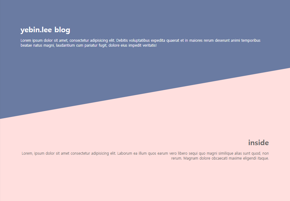
- 자꾸 skew이 안되서 뭐지뭐지 하면서 30분동안 쩔쩔 맸는데 transform: skewY(-10deg), translateY(-90px);라고 작성해서 안된거였다 ,, 정말 쉼표 세미클론 마침표 이 세개 오타 찾는 게 젤 어려운 거 같다,, 눈에 잘안들어온다 하하.......
'웹 > CSS' 카테고리의 다른 글
| [코딩 공부_45] css, filter에 대하여 (0) | 2021.04.06 |
|---|---|
| [코딩 공부_44] self_introduce 만들기_2 (0) | 2021.04.04 |
| [코딩 공부_42] self-introduce 만들기_1 (0) | 2021.04.01 |
| [코딩 공부_41] transitions 적용하기 (0) | 2021.03.31 |
| [코딩 공부_40] 음수마진(negative margin)에 대하여 (0) | 2021.03.29 |


댓글