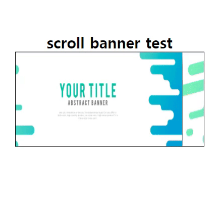
<실습1> 스크롤 배너 만들기
<!DOCTYPE html>
<html lang="ko">
<head>
<meta charset="UTF-8">
<title>infinte acroll banner</title>
<style>
    * {
        margin: 0;
        padding: 0;
        box-sizing: border-box;
    }
    .banner {
        transform: translate(0, 150px);
        text-align: center;
    }
    .banner-box {
        width: 400px;
        height: 200px;
        border: 1px solid #000;
        margin: 0 auto;
        overflow: hidden;
    }
    img {
        width: 400px;
        height: 200px;
    }
    .scroll {
        width: 1200px;
        font-size: 0;
        margin-left: 0px;
        animation: scroll 5s infinite alternate;
    }
    @keyframes scroll {
        0% {
            margin-left: 0px;
        }
        50% {
            margin-left: -400px;
        }
        100% {
            margin-left: -800px;
        }
    }
</style>
</head>
<body>
    <div class="banner">
        <h1>scroll banner test</h1>
        <div class="banner-box">
            <div class="scroll">
                <img src="./image/banner-1.jpg" alt="">
                <img src="./image/banner-2.jpg" alt="">
                <img src="./image/banner-3.jpg" alt="">
            </div>
        </div>
    </div>
</body>
</html>
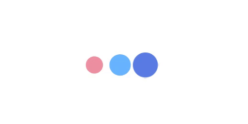
<실습2> 로딩바 만들기
<!DOCTYPE html>
<html lang="ko">
<head>
<meta charset="UTF-8">
<title>loading progress</title>
<style>
    .load {
        /* border: 1px solid #000; */
        text-align: center;
        transform: translate(0, 150px);

        padding: 2rem;
    }
    span {
        display: inline-block;
        width: 50px;
        height: 50px;
        border-radius: 50%;
        animation: load 1s infinite linear alternate;
    }
    span:nth-child(1) {
        background: crimson;
        animation-delay: 0;
    }
    span:nth-child(2) {
        background: dodgerblue;
        animation-delay: .2s;
    }
    span:nth-child(3) {
        background: royalblue;
        animation-delay: 0.4s;
    }
    @keyframes load {
        0% {
            opacity: 0;
            transform: scale(0);
        }
        50% {
            opacity: .5;
            transform: scale(.8);
        }
        100% {
            opacity: 1;
            transform: scale(1.2);
        }
    }

</style>
</head>
<body>
    <div class="load">
        <span></span>
        <span></span>
        <span></span>
    </div>
</body>
</html>
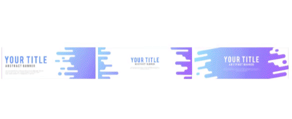
<실습3> hue 효과로 애니메이션 주기
<!DOCTYPE html>
<html lang="ko">
<head>
<meta charset="UTF-8">
<title>rotate img</title>
<style>
    body {
        text-align: center;
        transform: translate(0, 150px);

    }
    img {
        width: 200px;
        animation: rotateFilter 2s infinite;
    }
    img:nth-child(1) {
        background: dodgerblue;
    }
    img:nth-child(2) {
        background: royalblue;
    }
    img:nth-child(3) {
        background: lightpink;
    }
    @keyframes rotateFilter {
        from {
            filter: hue-rotate(0deg);
        }
        to {
            filter: hue-rotate(160deg);
        }
    }
</style>
</head>
<body>
<img src="./image/banner-1.jpg" alt="">
<img src="./image/banner-2.jpg" alt="">
<img src="./image/banner-3.jpg" alt="">
</body>
</html>
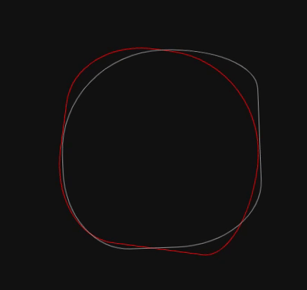
<실습4> 빙글빙글 돌아가게 만들기
<!DOCTYPE html>
<html lang="ko">
<head>
<meta charset="UTF-8">
<title>circle rotate</title>
<style>
    body {
        background: #111;
        transform: translate(0, 150px);

    }
    .box {
        width: 500px;
        margin: 0 auto;
    }
    .circle {
        margin: 0 auto;
        width: 300px;
        height: 300px;
        border: 1px solid #999;
        border-radius: 60% 45% 72% 65% / 45% 55% 70% 30%;
        animation: rotate 10s infinite;
    }
    .center {
        border: 1px solid red;
        animation-direction: reverse;
    }
    .last {
        animation-delay: 1s;
    }
    @keyframes rotate {
        0% {
            transform: rotate(0deg);
        }
        100% {
            transform: rotate(360deg);
        }
    }
</style>
</head>
<body>
    <div class="box">
        <div class="cirlcle">
            <div class="circle center">
                <div class="circle last">
                </div>
            </div>
        </div>
    </div>
</body>
</html>
<실습5> 타이핑 치듯이 만들기
<!DOCTYPE html>
<html lang="ko">
<head>
<meta charset="UTF-8">
<title>typing</title>

<style>
    .box {
        text-align: center;
        transform: translate(0, 150px);

    }
    h1 {
        text-align: center;
        /* border: 1px solid #000; */
        position: relative;
        display: inline-block;
        /* 투명하게 */
        color: transparent;
        letter-spacing: 5px;
    }
    h1:before {
        content: attr(data-text);
        color: #000;
        overflow: hidden;
        position: absolute;
        border-right: 1px solid #000;
        /* border: 1px solid red; */
        width: 0;
        /* 공백을 감싸지마! */
        white-space: nowrap;
        animation: typing 3s steps(14) infinite;
    }
    @keyframes typing {
        50% {
            width: 100%;

        }
    }
</style>
</head>
<body>
    <div class="box">
        <!-- data() -->
        <h1 data-text="우와!신기해">hello world</h1>
    </div>
</body>
</html>
<실습6> 나의 페이지에 적용시키기
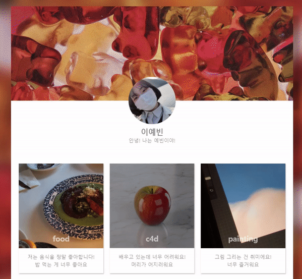
* 코드 생략
느낀점 : 홈페이지가 움직이니까 좀더 재미있고 멈춰있는 페이지보다 더 많이 집중되는 거 같다 !!
오늘은 내가 한 배너도 적용 시켜보는 시간이었는데 나의 작업물을 넣어보니 신기하고 더 애착이 가는 거 같다 ㅎㅎ!!
근데 배너가 놀이기구처럼 너무 왔다리 갔다리하는데 멈추고 싶지만 ... 어떻게 하는 지 잘모르겠다...
난 역시 응용이 너무 부족한 거 같다 ㅜㅜ..
'웹 > CSS' 카테고리의 다른 글
| [코딩 공부_49] 페이지 만들기-main편 (0) | 2021.04.09 |
|---|---|
| [코딩 공부_48] library 사용해보기(페이지 만들기-index편) (0) | 2021.04.09 |
| [코딩 공부_46] animation에 대하여 (0) | 2021.04.06 |
| [코딩 공부_45] css, filter에 대하여 (0) | 2021.04.06 |
| [코딩 공부_44] self_introduce 만들기_2 (0) | 2021.04.04 |


댓글